
We meet a family of unique entrepreneurs – too young to have their faces on their own website and designing bottles with real gold….
We work with high profile branding agencies who help food and drinks companies develop and bring new products to market. Talking to them we hear how challenging it is for seasoned brand and design professionals to develop a new product that stands out in all areas – the brand story, identity and packaging design.
So we’re delighted to talk to the brains behind beautiful and delicious Sibling Gin.
Snapped up by Fortnum & Mason, Harvey Nichols and exporting across Europe, this award-winning luxury brand is run by a special set of brothers and sisters Clarice, Cicely, Felix and Digby Elliott-Berry. Close, talented and so youthful that if you log on to http://siblingdistillery.com/who-we-are you’ll see that legally they can’t show their faces on the website as they’re all under 25.
We look at what it’s taken to create their own brand.
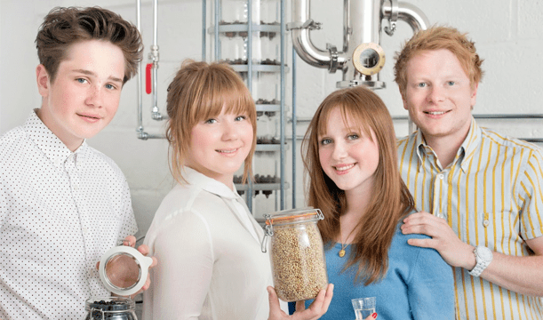
Founders Digby, Clarice, Cicely and Felix Elliott-Berry
Firstly Clarice, tell us how did your venture start ?
Creating Sibling was a very natural process. We always aimed to be self-employed as our parents have been. Spirits, in particular gin, were always a fascination for us and so it made sense to venture down that path. Knowing each other rather well, we easily slotted into roles, which allowed us to move quite quickly towards creating the company. We started with the end result in mind, but not the end product. We didn’t want to set our minds too strongly on recipes and designs until we had conducted research, as we are aware that our gin is not just for us!
What kind of research did Sibling undertake with regards to the overall brand ?
As the brand is strongly influenced by the four of us and the fact that we are family we wanted this to come across strongly in all aspects of Sibling. There aren’t so many drink brands that focus on this too much, so we were glad to be doing something different. We took a long time making sure we all fully supported and believed our mission statement, so that was the building blocks for the brand.
With designing the bottle, did you take any advice or research what people like ?
When designing the bottle we held focus groups of varying demographics and our target market to get an idea of what people liked and were inclined to choose. We did this in two stages, before they had tasted the gin and after, to see if the packaging represented the product well. We were never arrogant enough to believe that only our opinions on the design were right, so we welcomed other people’s feedback.
How many prototypes did you create to get to the final version?
We looked at a lot of different bottle types and shapes before we chose ours and then our designs for on the bottle were endless, I’m still surprised we came to an agreement! But once we had a clear vision of the brand and overall feel of the bottle it all came together swiftly, although the final adjustments seemed to go on forever until we forced ourselves to stop before we ruined it.
We never had a prototype of the bottle once the designs were finalised, the materials and processes the bottle has to undergo are so extensive that a prototype would have cost virtually the same amount as our first batch. So we just went for it! Fortunately, they arrived looking better than we could have hoped for.
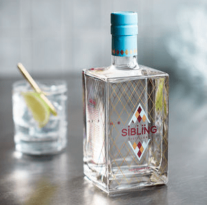
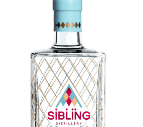
Moving onto Felix…Is there a reason that all of the elements on the bottle are four sided?
We wanted everything on the bottle to have a meaning behind it and to reflect where the business came from. As there are four siblings in our team we wanted everything to have four sides which gave us a nice head start on design
Are the colours symbolic for the make-up of the four of you?
There were a number of reasons that we chose the colours we did. Initially we were going to go for a simple pink and blue to symbolise the two boys and two girls in the team. However, as the design progressed we decided that it would also be nice to replicate in a more abstract way the red white and blue of our national flag, so that when it is sold abroad it still has that British look about it. The gold came in to replace the white as we felt it better represented the luxurious nature of the gin and we met in the middle with the pink/red to get our rich logo colour before finding a blue which matched both.
Who was the instigator of the current design and how long did it take?
Having spent the four years after leaving school working in a brand agency I (Felix) had no option but to take the lead on it – although in the end it was very much a team effort and we all had to agree when making the bigger design decisions. Contrary to some of the design projects I had worked on in the past it was actually really straightforward and everything fell into place pretty quickly thanks to the design/artwork skills of a former colleague.
What was the story behind it?
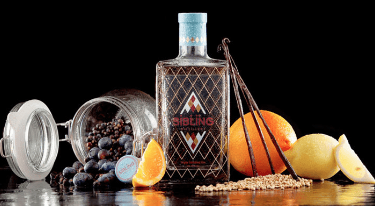
We had always wanted a pattern based design as opposed to object based, and being from Cheltenham we also wanted to represent that in a more abstract way than just putting the word on the bottle. This made us think about the things which Cheltenham is famous for; horse racing probably tops the list! With that in mind, we took initial inspiration from traditional racing silk designs, before choosing the four sided (significance explained earlier) harlequin style design as a base. Once we had decided on this, the colours fell into place pretty quickly. We were able to find a balance between traditional English styling and modern, opulent colours which replicated our ethos of finding the best combination of old and new.
Finally Cicely – Is it true you use real gold and why?
Yes we do, and it’s a matter of both beauty and practicality. We wanted a high shine finish so we looked for a way to do this, but there wasn’t a metallic ink that would survive the heat that we fire the bottles at (600 degrees C) so we had to use real gold. No half measures! (pun not intended)
Which branding and packaging do you admire yourself?
I love packaging that looks really smart and clean, but without being boring. I think packaging should still have an element of beauty no matter what style you’re going for, for us, everything is angular but I think it’s the use of colour that adds that element. Beauty can also be very time-less and it’s always a risk to design packaging that is very ‘on trend’. I really like Bonnard macaroons from Mexico they’re a tea shop, but their branding is ideal for what they serve and who they’re targeting (http://www.itsnicethat.com/articles/anagrama-bonnard). Skandinavisk scents are a great brand too (http://skandinavisk.com), modern and clean but not boring.
Do you have plans to branch out into other types of gin and therefore packaging?
This was something we always thought about, the bottle design is very versatile, and could easily have colours and finishes changed to suit new flavours, limited editions etc. it’s something we’re always talking about. Once we had a bottle sprayed with a frosted finish for a photoshoot and it looked so cool, we can see that there’s all sorts we could do with it. No plans for flavours yet, but we have equally plentiful ideas when the time comes.
What advice would you give to other start ups looking to bring a food or drink to market?
From a marketing point of view, don’t underestimate the power of design , in everything you’re doing not just your packaging and, don’t rush it. The same really for your product, there is absolutely no value in cutting corners. In terms of business, put all of your belief into your product, have absolute faith in it. That way you can fully enjoy its successes and on the flip-side, it will carry you when you’re feeling the strain.
Thanks to the Siblings for taking time to chat to us.